Brian took my face choice and criticism and made this.
Chomps, Take 8
“Wow! Great!” I said, “Except still not angry enough. I want his eyes bugging out as he’s so angry at whatever it is he is looking at.”
“Aww, @$%&!” Brian said, and then tried again.
Chomps, Take 9
“Uhh, now his eyes are bugging out too much now,” I said.
“Do you even know what you @$%& want?” Brian exclaimed, yet persevered.
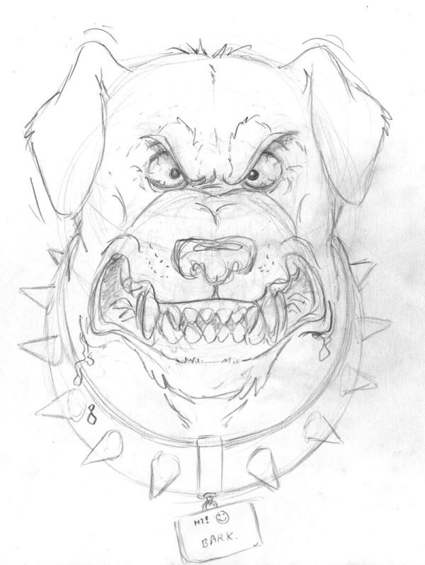
Chomps, Take 10
“There it is!” I yelled, “Absolutely perfect! Perfect… accept for the pupils. He looks cross-eyed.”
So Brian fixed that.
Chomps, Take 11
“Here you go,” he said, “Now BURN IN HELL!”
And thus all that was left was to ink it, color it, and come up with the wording and font for the t-shirt – simple stuff barely worth going over.
FRIDAY – THE UNVEILING OF THE T-SHIRT
FIRST! Finally, it only took a year to be first.
First!
Grrrrrrrrrrrreat!
Ah CraP!
no wonder it took so long to post!
Now that I’ve looked at the pictures, I agree that Take 11 is the best of them all. Good job Frank!
My only comment about the fimal take is why would Rumsfeld have a Smiley face on Champs Dog tag? I would htink it would just say “Chomps”
The comment about wanting the eyes bugged out more was a great set up for the picture. That is some quality funny.
Sorry Guys, but to me it looks more like a St. Bernard trying to stare down an avalanche.
Too chubby, and the ears don’t say “agression posture” to me.
I would actually be nervous sharing a city with ANY of those dogs. I might sarcastically start singing, “Give peace a chance”, be mistaken for the world’s only hippie who bathes and, well, that’s all she wrote….
Yours,
Wince
Awww…. Cute little doggie! Makes me want to just pick him up in my arms and give him a big hug. In fact, a hug isn’t enough. I want a big doggie kiss while I’m saying, “Oooh, How’s daddy’s wittle Fuzzy-wuzzy Chompsy-whompsy?”
But Clint – baby-waby talksy-walksy makes Chompsy-whompsy angry.
Very angry.
Now he looks like he’s smiling, or laughing at something funny. Like Mutley on that stupid old cartoon.
dont get me wrong, the artist is very talented…but all the drawings seem pretty comical to me.
I’m guessing i just lack the ability to visualize the final product
Makes you want to travel with a tbone in your briefcase.
Just in case.
ps. Brian has skills.
FIRST!! WHOO!
I like Chomps number 9.
Ok, I like the drool affect.
Can’t wait to see the final product.
You have succeded in pissing the guy off enough to use his rage in the drawing effort.
I don’t think he will ever be the same.
He may need years of therapy now.
I’m not in Hulk mode. Went out running, had a nice dinner, life is good. Agree with M1A1, the ears should be flared back to show tightly-coiled rage.
Rage… yes, anger and rage… like when I think about a world with Kerry as Pr– Pr– Pr– NO!! ummffff ARRRGHHH!! CHANGING!!! HULK!! HULK MAD!!! TEAR BUMPERS OFF CARS NOW!!!
Chomps needs hippy gristle in his teeth.
Should the points of his teeth be hitting each other like that? I’d think they should go into the gaps between the teeth above/below them. And those ears. They should be down and back, not floppy. And then there’s the smiley face that Shockwave mentioned…should it be a skull and crossbones?
Otherwise it looks pretty good:-)
Hmm,
Why does your guy’s Chomps remind me of “Spike” from the old MGM “Tom & Jerry” cartoons? Not exercising a little plagarism here, are we?
Ears are WAY too cute. They should be angry ears! A little more drool, and yes I like the idea of hippie gristle. Don’t forget the eyes must be red when you color it.
I don’t like the spiked collar. Chomps is so angry, he doesn’t need props. When I envision Chomps, he is so sleekly black, that all you can see are those sharp white teeth dripping with saliva, and eyes that look more red than amber.
I do like the drawing though, and can’t wait to see the finished product. I mean buy the finished product.